Quantcast
Channel: R-bloggers
Viewing all 2417 articles
Browse latest View live

The Ecology of Data Matrices: A Metaphor for Simultaneous Clustering

$
0
0

(This article was first published on Engaging Market Research, and kindly contributed to R-bloggers)
"...a metaphor is an affair between a predicate with a past and an object that yields while protesting." 

It is, as if, data matrices were alive. The rows are species, and the columns are habitats. At least that seems to be the case with recommender systems. Viewers seek out and watch only those movies that they expect to like while remaining unaware of most of what is released or viewed by others. The same applies to music. There are simply too many songs to listen to them all. In fact, most of us have very limited knowledge of what is available. Music genre may have become so defining of who we are and who we associate with that all of us have become specialists with little knowledge of what is on the market outside of our small circle.

Attention operates in a similar manner. How many ads are there on your web page or shown during your television program? Brand recognition is not random for we are drawn to the ones we know and prefer. We call it "affordance" when the columns of our data matrices are objects or activities: what to eat on a diet or what to do on a vacation. However, each of us can name only a small subset of all that can be eaten when dieting or all that can be done on a vacation. Preference is at work even before thinking and is what gets stuff noticed.

Such data create problems for statistical modeling that focuses solely on the rows or on the columns and treats the other mode as fixed. For example, cluster analysis takes the columns as given and calculates pairwise distances between rows (hierarchical clustering) or distances of rows from cluster centroids (kmeans). This has become a serious concern for the clustering of high dimensional data as we have seen with the proliferation of names for the simultaneous clustering of rows and columns: biclustering, co-clustering, subspace clustering, bidimensional clustering, block clustering, two-mode or two-way clustering and many more. The culprit is that the rows and columns are confounded sufficiently that it makes less and less sense to treat them as independent entities. High dimensionality only makes the confounding more pronounced.

As a marketing researcher, I work with consumers and companies who have intentions and act on them. Thus, I find the ecology metaphor compelling. It is not mandatory, and you are free to think of the data matrix as a complex system within which rows and columns are coupled. Moreover, the ecology metaphor does yield additional benefits since numerical ecology has a long history of trying to quantify dissimilarity given the double-zero problem. The Environmetrics Task View list the R packages dealing with this problem under the subheading Dissimilarity Coefficients. Are two R programmers more or less similar if neither of them has any experience with numerical ecology in R? This is the double-zero problem. The presence of two species in a habitat does not mean the same as the absence of two species. One can see similar concerns raised in statistics and machine learning under the heading "the curse of dimensionality" (see Section 3 of this older but well-written explanation).

Simultaneous Clustering in R

In order to provide a lay of the land, I will name at least five different approaches to simultaneous clustering. Accompanying each approach is an illustrative R package. The heading, simultaneous clustering, is meant to convey that the rows and columns are linked in ways that ought to impact the analysis. However, the diversity of the proposed solutions makes any single heading unsatisfying.
  1. Matrix factorization (NMF),
  2. Biclustering (biclust),
  3. Variable selection  (clustvarsel),
  4. Regularization (sparcl) , and
  5. Subspace clustering (HDclassif).
Clearly, there is more than one R package in each category, but I was more interested in an example than a catalog. I am not legislating; you are free to sort these R packages into your own categories and provide more or different R packages. I have made some distinctions that I believe are important and selected the packages that illustrate my point. I intend to be brief.

(1) Nonnegative matrix factorization (NMF) is an algorithm from linear algebra that decomposes the data matrix into the product of a row and column representation. If one were to separate clustering approaches into generative models and summarizing techniques, all matrix factorizations would fall toward the summary side of the separation. My blog is full of recent posts illustrating how well NMF works with marketing data.

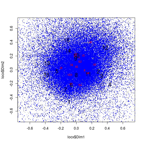
(2) Biclustering has the feel of a Rubik's Cube with row and columns being relocated. Though the data matrix is not a cube, the analogy works because one gets the dynamics of moving entire rows and columns all at the same time. In spite of the fact that the following figure is actually from the BlockCluster R package, it illustrates the concept. Panel a contains the data matrix for 10 rows labeled A through J and 7 numbered columns. Panel b reorders the rows (note for instance that row B is move down and row H is moved up). Panel c continues the process by reordering some columns so that they follow the pattern summarized schematically in Panel d. To see how this plays out in practice, I have added this link to a market segmentation study analyzed with the biclust R package.


Now, we return to generative models. (3) Variable selection is a variation on the finite mixture model from the model-based clustering R package mclust. As the name implies, it selects those variables needed to separate the clusters. The goal is to improve performance by removing irrelevant variables. More is better only when the more does not add more noise, in which case, more blurs the distinctions among the clusters. (4) Following the same line of reasoning, sparse clustering relies on a lasso-type penalty (regularization) to select features by assigning zero or near zero weights to the less differentiating variables. The term "sparse" refers to the variable weights and not the data matrix. Both variable selection and spare clustering deal with high dimensionality by reducing the number of variables contributing to the cluster solution.

(5) This brings us to my last category of subspace clustering, which I will introduce using the pop-up toaster as my example. Yes, I am speaking of the electric kitchen appliance with a lever and slots for slices of bread and other toastables ("let go of my eggo"). If you have a number of small children in the family, you might care about safety features, number of slots and speed of heating. On the other hand, an upscale empty nester might be concerned about the brand or how it looks on the counter when they entertain. The two segments reside in different subspaces, each with low dimensionality, but defined by different dimensions. The caring parent must know if the unit automatically shuts off when the toaster falls off the counter. The empty nester never inquires and has no idea.

None of this would be much of an issue if it did not conceal the underlying cluster solution. All measurement adds noise, and noise makes the irrelevant appear to have some minor impact. The higher the data dimensionality, the greater the distortion. Consumers will respond to every question even when asked about the unattended, the inconsequential or the unknown. Random noise is bad; systematic bias is even worst (e.g., social desirability, acquiescence and all the other measurement biases). Sparse clustering pushes the minor effects toward zero. Subspace clustering allows the clusters to have their own factor structures with only a very few intrinsic dimensions (as HDclassif calls it). For one segment the toaster is an appliance that looks good and prepares food to taste. For the other segment it is a way to feed quickly and avoid complaints while not getting anyone injured in the process. These worlds are as incommensurable as ever imagined by Thomas Kuhn.


To leave a comment for the author, please follow the link and comment on his blog: Engaging Market Research.

R-bloggers.com offers daily e-mail updates about R news and tutorials on topics such as: visualization (ggplot2, Boxplots, maps, animation), programming (RStudio, Sweave, LaTeX, SQL, Eclipse, git, hadoop, Web Scraping) statistics (regression, PCA, time series, trading) and more...

RDataMining Slides Series

$
0
0

(This article was first published on blog.RDataMining.com, and kindly contributed to R-bloggers)

by Yanchang Zhao, RDataMining.com

I have made a series of slides on R and data mining, based on my book titled R and Data Mining — Examples and Case Studies. The slides will be used at my presentations at seminars to graduate students at Universidad Juárez Autónoma de Tabasco (UJAT), prior to my keynote speech on Analysing Twitter Data with Text Mining and Social Network Analysis at the CONAIS 2014 conference in Mexico in October 2014.

The slides cover seven topics below. Click the links to download them in PDF files.

I will make more slides in near future, such as social network analysis with R and big data analysis with R. Keep tuned with RDataMining.com.


To leave a comment for the author, please follow the link and comment on his blog: blog.RDataMining.com.

R-bloggers.com offers daily e-mail updates about R news and tutorials on topics such as: visualization (ggplot2, Boxplots, maps, animation), programming (RStudio, Sweave, LaTeX, SQL, Eclipse, git, hadoop, Web Scraping) statistics (regression, PCA, time series, trading) and more...

Newcastle R course, a write-up

$
0
0

I recently attended a week-long R course in Newcastle, taught by Colin Gillespie. It went from “An Introduction to R” to “Advanced Graphics” via a day each on modelling, efficiency and programming. Suffice to say it was an intense 5 days!

Overall it was the best R course I’ve been on so far. I’d recommend it to others, from advanced users to adventurous novices. Below I explain why, with a brief description of each day and an emphasis on day 2.

Day 1

Day 1 introduced R in the context of alternatives: Python, SAS and the dreaded Microsoft Excel. Amusingly, Excel was often used as a reason of why to use R. I skipped the second half of the day but from what I saw it seemed a fun and practical introduction to an ostensibly dry subject.

Day 2

On the second day, we moved firmly into the realm of applications with a focus on statistics. In addition to new insights into R, I also gained new insights into statistical test. I wasn’t expecting this when signing up to an R course but it was well worth it. Colin’s description of the T-test, the related QQ plot and other commonly used tests were some of the clearest I’ve ever heard.

Quirks in R were raised, providing insight into its origins, one example being the number of datasets lying around: “An artifact of R being designed by statisticians is that there are loads of random datasets just lying around.”

Insights into T tests in R

sleep is a dataset in base R on the impact of different drugs on sleeping patterns of 10 students, which is actually rather useful for explaining t tests in R.

head(sleep)
##   extra group ID
## 1   0.7     1  1
## 2  -1.6     1  2
## 3  -0.2     1  3
## 4  -1.2     1  4
## 5  -0.1     1  5
## 6   3.4     1  6

A trick I didn’t know was that tapply can be used to run a command on sub-groups within a single vector:

tapply(sleep$extra, INDEX = sleep$group, FUN = sd)
##     1     2 
## 1.789 2.002

This shows that the standard deviation of extra sleep values are comparable, with the second group’s response showing slightly higher variability. These are the types of test needed to check whether the t test is appropriate. Because a t test is appropriate, we go ahead and run it, resulting in a significant difference between the two drugs:

t.test(extra ~ group, paired = TRUE, data = sleep, )
## 
##  Paired t-test
## 
## data:  extra by group
## t = -4.062, df = 9, p-value = 0.002833
## alternative hypothesis: true difference in means is not equal to 0
## 95 percent confidence interval:
##  -2.4599 -0.7001
## sample estimates:
## mean of the differences 
##                   -1.58

A new insight into lists

The list is a well-known data class in R, used to contain collections of any other objects. I’ve always known that list objects should be referred to using the double square bracket notation - e.g. [[5]]. But what I never knew, until attending this course, was why. Lets take a look at a simple example:

lst <- list(x = c(1:3), y = "z", z = c(2:4))
lst[[1]]
## [1] 1 2 3
lst[1]
## $x
## [1] 1 2 3

We can see the second output is printed differently: the only difference between the single and double notation is the output type. Double square brackets output the object’s inate data type; single square brackets always output another list. This explains the error in the following code:

lst[1:2]
## $x
## [1] 1 2 3
## 
## $y
## [1] "z"
lst[[1:2]]
## [1] 2
lst[1:3]
## $x
## [1] 1 2 3
## 
## $y
## [1] "z"
## 
## $z
## [1] 2 3 4
lst[[1:3]]
## Error: recursive indexing failed at level 2

In the second line the output seems unintuitive. This is how it works: 1:2 is the same as c(1, 2), a vector of length 2 and each number refers to a different ‘level’ in the list. Therefore [[c(2, 2)]] fails where [c(2,2)] succeeds:

lst[[c(2, 2)]]
## Error: subscript out of bounds
lst[c(2, 2)]
## $y
## [1] "z"
## 
## $y
## [1] "z"

Adding interaction in ANOVA models

Another interesting little tidbit of knowledge I learned on the course was that the : symbol can be used in R formulae to represent interaction between two independent variables. Thus, y ~ a + b + a:b includes the influence of a and b on y, as well as the impact of their interaction. However, R users usually save time by writing this simply as y ~ a * b.

To test this example was provided - the latter two tests generate the same result (not shown):

m1 <- aov(weightgain ~ source, data = ratfeed)
summary(m1)
  
m2 <- aov(weightgain ~ source * type, data = ratfeed)
summary(m2)

m3 <- aov(weightgain ~ source * type, data = ratfeed)
summary(m3)

No-nonsense introduction to clustering

Clustering is something that always seemed rather mysterious to me. The criteria by which observations are deemed ‘similar’ appear arbitrary. Indeed, Colin stated that ‘clustering never proves anything’ and that there are always infinite ways to cluster observations. The no-nonsense description was a breath of fresh air compared with other descriptions of clustering which hide the process behind a wall of jargon.

The simplest way to cluster data is via ‘Euclidean distance’ between each combination of observations. The distance between observation 1 and 2, for example, is simply, the sum of squared differences between each variable:

[(x_{11} - x_{21})^2 + (x_{12} - x_{22})^2 + ... + (x_{n2} - x_{n2})^2]

Day 3

Day 3 provided a solid introduction to programming in R with attention paid to if statements, function creations, the bizarre yet useful apply family and recommended R workflows.

It was great to have a solid description of if statements in R, which I’d used tentatively before but never felt 100% sure using. The following example was used to demonstrate multiple ifs and the final else that completes such structures:

x <- 5
if(x > 10){
  message("x is greater than 10")
} else if(x > 5){
  message("x is greater than 5")
} else if(x > 0){
  message("x is greater than 0")
} else if(x > -5){
  message("x is greater than -5")
} else {
  message("x is less than -5")
}
## x is greater than 0

Also, Colin’s description of R workflows was very useful: I already used a variant of it, but the description of how to structure work reaffirmed the importance of order for me and will be of use next time I teach R.

This is a variant of the file structure Colin recommends, that I’m implementing on an R for spatial microsimulation book project I’m working on:

|-- book.Rmd
|-- data
|-- figures
|-- output
|-- R
|   |-- load.R
|   `-- parallel-ipfp.R
`-- spatial-microsim-book.Rproj

Day 4

On Day 4 we were guided through benchmarking in R and its importance for developing fast code. I learned about the parallel package which is hidden away in base R (its functions are only activated with library(parallel) — try it!). parallel provides parallel versions of some of the apply functions, such as parApply. This is really useful if you have speed critical applications running on multi-core devices.

Parallelisation might get you a speed boost of a factor of 2 to 4, but dumb code can hit you with a 100 fold speed penalty. Therefore the priority should be to check your code for bottlenecks before even considering parallelisation.

A good example is avoiding object recreation/expansion during for loops: create the vector size you want outside the loop. This explains why m1 is so much slower than the rest. We also looked at vectorisation: m3 illustrates that vectorised code is often faster than for loop alternatives:

# method 1
m1 <- function(n){ mvec = NULL
for(i in 1:n){
  mvec = c(mvec, i)
}
}

# method 2
m2 <- function(n){
mvec = numeric(n)
for(i in 1:n){
  mvec[i] <- i
}
}

# method 3
m3 <- function(n){1:n}

library(microbenchmark)
n = 10000
mb <- microbenchmark(m1(n), m2(n), m3(n), times = 2L)
print(mb)
## Unit: microseconds
##   expr       min        lq    median        uq       max neval
##  m1(n) 161579.59 161579.59 167862.32 174145.05 174145.05     2
##  m2(n)   8500.44   8500.44   9222.45   9944.45   9944.45     2
##  m3(n)     19.66     19.66     21.49     23.33     23.33     2

Day 5

The was the reward for all our hard work on the other days: making pretty pictures. We looked into the internals of ggplot2 and found a powerhouse graphics package inside. A guy sitting next to me used the insight gleaned from this final day to re-draw a plot he was presenting the subsequent week, so it was certainly useful!

Conclusion

Overall it was well worth the time and money and I look forward to attending the more advanced course on “Advanced Programming in R” and package creation. The course materials were excellent: clear, concise and entertaining at times (the first R tutorials I’ve seen plastered with cartoons!).

The practicals were based on a series of R packages that can be installed for free. Simply typing the following will give you an insight into the teaching on offer, and allow you to play Monopoly in R!

install.packages("nclRintroduction", repos = "http://r-forge.r-project.org")
install.packages("nclRmodelling", repos = "http://r-forge.r-project.org")
install.packages("nclRprogramming", repos = "http://r-forge.r-project.org/")
install.packages("nclRefficient", repos = "http://r-forge.r-project.org")

library(nclRprogramming)
vignette(package = "nclRprogramming")
vignette(topic = "practical2b", package = "nclRprogramming")

If you struggle with any of the questions, maybe you need to attend an R course or read a book to brush up! Stackoverflow is great but for some things you cannot beat face to face interaction or the depth of a book.

Robin Lovelace

Trying a prefmap

$
0
0

(This article was first published on Wiekvoet, and kindly contributed to R-bloggers)
Preference mapping is a key technique in sensory and consumer research. It links the sensory perception on products to the liking of products and hence provides clues to the development of new, well tasting, products. Even though it is a key technique, it is also a long standing problem how to perform such an analysis. In R the SensoMineR package provides a prefmap procedure. This post attempts to create such an analysis with Stan.

Data

Data are the coctail data from the SensoMineR package. After conversion to a scale 0 to 10 with 10 most liked, the product means are:
   means
1   5.03
2   3.02
3   5.42
4   3.55
5   5.67
6   5.74
7   3.84
8   3.75
9   4.17
10  4.26
11  3.20
12  3.88
13  5.98
14  3.95
15  6.47
16  4.90


Model

The model is build upon my post of last week: Mapping products in a space . What is added is a consumer section. Each consumer's preference is modeled as a ideal point, where liking is maximum, with points further away liked less and less. In mathematical terms the distance dependent function is maxliking * e-distance*scale. The ideal point is captured by three numbers; its liking and its coordinates. The scale function is, for now, common for all consumers. In addition there is a lot of code for administration of all parameters.
model1 <- "
data {
        int<lower=0> ndescriptor;
        int<lower=0> nproduct;
        matrix[nproduct,ndescriptor] profile;
    int<lower=0> nconsumer;
    matrix[nproduct,nconsumer] liking;
}
parameters {
    row_vector[nproduct] prodsp1;
    row_vector[nproduct] prodsp2;
    real<lower=0,upper=1> sigma1;
    real<lower=0,upper=1> sigma2;
    matrix [nconsumer,2] optim;
    vector <lower=0> [nconsumer] maxima;
    real <lower=0> scale;
    real <lower=0> sliking;
}
transformed parameters {
   vector [ndescriptor] descrsp1;
   vector [ndescriptor] descrsp2;
     matrix[nproduct,ndescriptor] expected1;  
     matrix[nproduct,ndescriptor] expected2;  
     matrix[nproduct,ndescriptor] residual1;  
     vector[nproduct] distances;
     matrix[nproduct,nconsumer] likepred;


   descrsp1 <- profile'*prodsp1';
   expected1 <- (descrsp1*prodsp1)';
   residual1 <- profile-expected1;
   descrsp2 <- profile'*prodsp2';
   expected2 <- (descrsp2*prodsp2)';
   for (i in 1:nconsumer) {
      for (r in 1:nproduct) {
      distances[r] <- sqrt(square(prodsp1[r]-optim[i,1])+
                           square(prodsp2[r]-optim[i,2]));
      likepred[r,i] <- maxima[i]*exp(-distances[r]*scale);
      }
   }
}
model {  
     for (r in 1:nproduct) {
        prodsp1[r] ~ normal(0,1);
        prodsp2[r] ~ normal(0,1);
        for (c in 1:ndescriptor) {
           profile[r,c] ~ normal(expected1[r,c],sigma1);
           residual1[r,c] ~ normal(expected2[r,c],sigma2);
        }
        for (i in 1:nconsumer) {
           liking[r,i] ~ normal(likepred[r,i],sliking);
           optim[i,1] ~ normal(0,2);
           optim[i,2] ~ normal(0,2);
        }
    scale ~ normal(1,.1);
    maxima ~ normal(5,2);
    sliking ~ normal(2,1);
    }
}
generated quantities {
   vector [ndescriptor] descrspace1;
   vector [ndescriptor] descrspace2;
   row_vector [nproduct] prodspace1;
   row_vector [nproduct] prodspace2;
   matrix [nconsumer,2] optima;

   prodspace1 <-(
                     ((prodsp1[12]>0)*prodsp1)-
                     ((prodsp1[12]<0)*prodsp1)
                  );
   prodspace2 <-(
                     ((prodsp2[12]>0)*prodsp2)-
                     ((prodsp2[12]<0)*prodsp2)
                  ); 
   descrspace1 <-(
                     ((prodsp1[12]>0)*descrsp1)-
                     ((prodsp1[12]<0)*descrsp1)
                  );
   descrspace2 <-(
                     ((prodsp2[12]>0)*descrsp2)-
                     ((prodsp2[12]<0)*descrsp2)
                  ); 
   for (i in 1:nconsumer) {
      optima[i,1] <- (
                        ((prodsp1[12]>0)*optim[i,1])-
                        ((prodsp1[12]<0)*optim[i,1])
                     );
      optima[i,2] <- (
                        ((prodsp2[12]>0)*optim[i,2])-
                        ((prodsp2[12]<0)*optim[i,2])
                     );
   }
}
"

Analysis results

Sensominer's result

For comparative reasons the plot resulting from SensoMineR's carto() function. I have followed the parameter settings from the SensoMineR package to get this plot. Color is liking, numbered dots are products. The blue zone is best liked, as can be seen from the products with highest means residing there.

New method

In the plot the blue dots are samples of ideal points, the bigger black numbers are locations of products and the smaller red numbers are consumer's ideal points.
This is different from the SensoMineR map , the consumers have pulled well liked products such as 13 and 15 to the center. In a way, I suspect that in this analysis the consumer's preference has overruled most information from the sensory space. Given that, I will be splitting consumers.

Three groups of consumers

Three groups of consumers were created via k-means clustering. From sensory and consumer insight point of view the clusters may describe three different ways to experience the particular products. Obviously a clustering upon demographics or marketing segments may be equally valid, but I don't have that information. The cluster sizes are 15, 52 and 33 respectively.

Cluster 1

This cluster is characterized by liking for products 8 to 11. Compared to the original space, this cluster does not like products 13 and 15 so much, does not dislike product 4 and 12 so much.

Cluster 2

These are the bulk of the consumers and the result of all consumers is more pronounced. However, product 1 has shifter quite a distance to liked.

Cluster 3

This plot is again fairly similar to the all consumer plot. What is noticeable here is that there is a void in the center. The center of the most liked region is not occupied.

Next Steps

There are still some things to improve in this approach. Better tuning of the various priors in the model. Modeling the range of consumer's liking rather than solely their maximum. It may be possible to have the scale parameter subject dependent. Perhaps a better way to extract the dimensions from sensory space, thereby avoiding the Jacobian warning and using estimated standard deviations of the sensory profiling data. Finally, improved graphics.

Code

# Reading and first map

# senso.cocktail
# hedo.cocktail
library(SensoMineR)
data(cocktail)
res.pca <- PCA(senso.cocktail,graph=FALSE)
# SensoMineR does a dev.new for each graph, hence captured like this.
dev.new <- function() png('carto.png')
res.carto <- carto(res.pca$ind$coord[,1:2],
    graph.tree=FALSE,
    graph.corr=FALSE,
    hedo.cocktail)
dev.off()
# reset default graph settings
rm(dev.new)
dev.new()

# model

library(rstan)
nprod <- 16
ndescr <- 13
nconsumer <- 100
sprofile <- as.matrix(scale(senso.cocktail))
datain <- list(
    nproduct=nprod,
    ndescriptor=ndescr,
    profile=sprofile,
    nconsumer=nconsumer,
    liking = as.matrix(10-hedo.cocktail[,1:nconsumer])
)
data.frame(means=rowMeans(10-hedo.cocktail)  )

model1 <- "
data {
        int<lower=0> ndescriptor;
        int<lower=0> nproduct;
        matrix[nproduct,ndescriptor] profile;
    int<lower=0> nconsumer;
    matrix[nproduct,nconsumer] liking;
}
parameters {
    row_vector[nproduct] prodsp1;
    row_vector[nproduct] prodsp2;
    real<lower=0,upper=1> sigma1;
    real<lower=0,upper=1> sigma2;
    matrix [nconsumer,2] optim;
    vector <lower=0> [nconsumer] maxima;
    real <lower=0> scale;
    real <lower=0> sliking;
}
transformed parameters {
   vector [ndescriptor] descrsp1;
   vector [ndescriptor] descrsp2;
     matrix[nproduct,ndescriptor] expected1;  
     matrix[nproduct,ndescriptor] expected2;  
     matrix[nproduct,ndescriptor] residual1;  
     vector[nproduct] distances;
     matrix[nproduct,nconsumer] likepred;


   descrsp1 <- profile'*prodsp1';
   expected1 <- (descrsp1*prodsp1)';
   residual1 <- profile-expected1;
   descrsp2 <- profile'*prodsp2';
   expected2 <- (descrsp2*prodsp2)';
   for (i in 1:nconsumer) {
      for (r in 1:nproduct) {
      distances[r] <- sqrt(square(prodsp1[r]-optim[i,1])+
                           square(prodsp2[r]-optim[i,2]));
      likepred[r,i] <- maxima[i]*exp(-distances[r]*scale);
      }
   }
}
model {  
     for (r in 1:nproduct) {
        prodsp1[r] ~ normal(0,1);
        prodsp2[r] ~ normal(0,1);
        for (c in 1:ndescriptor) {
           profile[r,c] ~ normal(expected1[r,c],sigma1);
           residual1[r,c] ~ normal(expected2[r,c],sigma2);
        }
        for (i in 1:nconsumer) {
           liking[r,i] ~ normal(likepred[r,i],sliking);
           optim[i,1] ~ normal(0,2);
           optim[i,2] ~ normal(0,2);
        }
    scale ~ normal(1,.1);
    maxima ~ normal(5,2);
    sliking ~ normal(2,1);
    }
}
generated quantities {
   vector [ndescriptor] descrspace1;
   vector [ndescriptor] descrspace2;
   row_vector [nproduct] prodspace1;
   row_vector [nproduct] prodspace2;
   matrix [nconsumer,2] optima;

   prodspace1 <-(
                     ((prodsp1[12]>0)*prodsp1)-
                     ((prodsp1[12]<0)*prodsp1)
                  );
   prodspace2 <-(
                     ((prodsp2[12]>0)*prodsp2)-
                     ((prodsp2[12]<0)*prodsp2)
                  ); 
   descrspace1 <-(
                     ((prodsp1[12]>0)*descrsp1)-
                     ((prodsp1[12]<0)*descrsp1)
                  );
   descrspace2 <-(
                     ((prodsp2[12]>0)*descrsp2)-
                     ((prodsp2[12]<0)*descrsp2)
                  ); 
   for (i in 1:nconsumer) {
      optima[i,1] <- (
                        ((prodsp1[12]>0)*optim[i,1])-
                        ((prodsp1[12]<0)*optim[i,1])
                     );
      optima[i,2] <- (
                        ((prodsp2[12]>0)*optim[i,2])-
                        ((prodsp2[12]<0)*optim[i,2])
                     );
   }
}
"

pars <- c('prodspace1','prodspace2','optima','scale','maxima')

fit <- stan(model_code = model1,
    data = datain,
    pars=pars)

# plotting

fitsamps <- as.data.frame(fit)

combiplot <- function(fitsamps,datain,labs) {
    prod <- reshape(fitsamps,
        drop=names(fitsamps)[33:ncol(fitsamps)],
        direction='long',
        varying=list(names(fitsamps)[1:16],
            names(fitsamps)[17:32]),
        timevar='sample',
        times=1:16,
        v.names=c('PDim1','PDim2')
    )
        sa <- sapply(1:16,function(x)
            c(sample=x,
                Dim1=mean(prod$PDim1[prod$sample==x]),
                Dim2=mean(prod$PDim2[prod$sample==x])))
    sa <- as.data.frame(t(sa))
   
    optimindex <- grep('optima',names(fitsamps))
    noptim <- datain$nconsumer
    loc <- reshape(fitsamps,
        drop=names(fitsamps)[(1:ncol(fitsamps))[-optimindex]],
        direction='long',
        varying=list(names(fitsamps)[optimindex[1:noptim]],
            names(fitsamps)[optimindex[(1:noptim)+noptim]]),
        timevar='subject',
        times=1:noptim,
        v.names=c('Dim1','Dim2')
    )
    locx <- loc[sample(nrow(loc),60000),]
    plot(locx$Dim1,locx$Dim2,
        col='blue',
        pch=46,
        cex=2,
        xlim=c(-1,1)*.7,
        ylim=c(-1,1)*.7)
    sa2 <- sapply(1:noptim,function(x)
            c(sample=x,
                Dim1=mean(loc$Dim1[loc$subject==x]),
                Dim2=mean(loc$Dim2[loc$subject==x])))
    sa2 <- as.data.frame(t(sa2))
    text(x=sa2$Dim1,y=sa2$Dim2,labels=labs,cex=.8,col='red')
    text(x=sa$Dim1,y=sa$Dim2,labels=sa$sample,cex=1.5)
    invisible(fitsamps)
}

combiplot(fitsamps,datain,1:100)

# three clusters

tlik <- t(scale(hedo.cocktail))
km <- kmeans(tlik,centers=3)
table(km$cluster)


datain1 <- list(
    nproduct=nprod,
    ndescriptor=ndescr,
    profile=sprofile,
    nconsumer=sum(km$cluster==1),
    liking = as.matrix(10-hedo.cocktail[,km$cluster==1])
)
fit1 <- stan(model_code = model1,
    data = datain1,
    fit=fit,
    pars=pars)

fitsamps1 <- as.data.frame(fit1)
#

datain2 <- list(
    nproduct=nprod,
    ndescriptor=ndescr,
    profile=sprofile,
    nconsumer=sum(km$cluster==2),
    liking = as.matrix(10-hedo.cocktail[,km$cluster==2])
)
fit2 <- stan(model_code = model1,
    data = datain2,
    fit=fit,
    pars=pars)

fitsamps2 <- as.data.frame(fit2)
##
datain3 <- list(
    nproduct=nprod,
    ndescriptor=ndescr,
    profile=sprofile,
    nconsumer=sum(km$cluster==3),
    liking = as.matrix(10-hedo.cocktail[,km$cluster==3])
)
fit3 <- stan(model_code = model1,
    data = datain3,
    fit=fit,
    pars=pars)

fitsamps3 <- as.data.frame(fit3)
combiplot(fitsamps1,datain1,which(km$cluster==1))
combiplot(fitsamps2,datain2,which(km$cluster==2))
combiplot(fitsamps3,datain3,which(km$cluster==3))

To leave a comment for the author, please follow the link and comment on his blog: Wiekvoet.

R-bloggers.com offers daily e-mail updates about R news and tutorials on topics such as: visualization (ggplot2, Boxplots, maps, animation), programming (RStudio, Sweave, LaTeX, SQL, Eclipse, git, hadoop, Web Scraping) statistics (regression, PCA, time series, trading) and more...

One datavis for you, ten for me

$
0
0

(This article was first published on bayesianbiologist » Rstats, and kindly contributed to R-bloggers)

Over the years of my graduate studies I made a lot of plots. I mean tonnes. To get an extremely conservative estimate I grep’ed for every instance of “plot(” in all of the many R scripts I wrote over the past five years.


find . -iname "*.R" -print0 | xargs -L1 -0 egrep -r "plot(" | wc -l

2922

The actual number is very likely orders of magnitude larger as 1) many of these plot statements are in loops, 2) it doesn’t capture how many times I may have ran a given script, 3) it doesn’t look at previous versions, 4) plot is not the only command to generate figures in R (eg hist), and 5) early in my graduate career I mainly used gnuplot and near the end I was using more and more matplotlib. But even at this lower bound, that’s nearly 3,000 plots. A quick look at the TOC of my thesis reveals a grand total of 33 figures. Were all the rest a waste? (Hint: No.)

The overwhelming majority of the plots that I created served a very different function than these final, publication-ready figures. Generally, visualizations are either:

  • A) Communication between you and data, or
  • B) Communication between you and someone else, though data.

These two modes serve very different purposes and can require taking different approaches in their creation. Visualizations in the first mode need only be quick and dirty. You can often forget about all that nice axis labeling, optimal color contrast, and whiz-bang interactivity. As per my estimates above, this made up at the very least 10:1 of visuals created. The important thing is that, in this mode, you already have all of the context. You know what the variables are, you know what the colors, shapes, sizes, and layouts mean – after all, you just coded it. The beauty of this is that you can iterate on these plots very quickly. The conversation between you and the data can dialog back and forth as you intrepidly explore and shine your light into all of it’s dark little corners.

In the second mode, you are telling a story to someone else. Much more thought and care needs to be placed on ensuring that the whole story is being told with the visualization. It is all too easy to produce something that makes sense to you, but is completely unintelligible to your intended audience. I’ve learned the hard way that this kind of visual should always be test-driven by someone who, ideally, is a member of your intended audience. When you are as steeped in the data as you most likely are, your mind will fill in any missing pieces of the story – something your audience won’t do.

In my new role as part of the Data Science team at Penn Medicine, I’ll be making more and more data visualizations in the second mode. A little less talking to myself with data, and a little more communicating with others through data. I’ll be sharing some of my experiences, tools, wins, and disasters here. Stay tuned!


To leave a comment for the author, please follow the link and comment on his blog: bayesianbiologist » Rstats.

R-bloggers.com offers daily e-mail updates about R news and tutorials on topics such as: visualization (ggplot2, Boxplots, maps, animation), programming (RStudio, Sweave, LaTeX, SQL, Eclipse, git, hadoop, Web Scraping) statistics (regression, PCA, time series, trading) and more...

How do you say π^π^π?

$
0
0

(This article was first published on Econometrics by Simulation, and kindly contributed to R-bloggers)
Well, not that you really probably want to know how to say such an absurdly large number. However for those of you who are interested (allowing for rounding) it is:


one quintillion, three hundred forty quadrillion, one hundred sixty-four trillion, one hundred eighty-three billion, six million, three hundred thirty-nine thousand, eight hundred forty
 
And yes you can find out how to write your very own absurdly long numbers as well in R! I have adapted John Fox's numbers2words function in order to allow for both absurdly long words as well as decimals. We can see some examples below:
 
> number2words(.1)
[1] "one tenths"
> number2words(94.488)
[1] "ninety-four and four hundred eighty-eight thousandths"
> number2words(-12187.1, proper=T)
[1] "minus twelve thousand, one hundred eighty-seven and one tenths"
[2] "12,187.1"
> number2words(123)
[1] "one hundred twenty-three"
 
You can find the code on github

To leave a comment for the author, please follow the link and comment on his blog: Econometrics by Simulation.

R-bloggers.com offers daily e-mail updates about R news and tutorials on topics such as: visualization (ggplot2, Boxplots, maps, animation), programming (RStudio, Sweave, LaTeX, SQL, Eclipse, git, hadoop, Web Scraping) statistics (regression, PCA, time series, trading) and more...

Creating a map showing land covered by rising sea levels

$
0
0

(This article was first published on The Shape of Code » R, and kindly contributed to R-bloggers)

I joined the Geekli.st climate Hackathon this weekend at the Hub Westminster (my favorite venue for Hackathons). While the organizers had lots of enthusiasm they had very little in the way of data for us to work on. No problem, ever since the Flood-relief hackathon I have wanted to use the SRTM ‘whole Earth’ elevation data on a flood related hack. Since this was a climate change related hack the obvious thing to do was to use the data to map the impact of any increases in sea level (try it, with wording for stronger believers).

The hacking officially started Friday evening at 19:00, but I only attended the evening event to meet people and form a team. Rob Finean was interested in the idea of mapping the effects of sea a rise in level (he also had previous experience using leaflet, a JavaScript library for interactive maps) and we formed a team, Florian Rathgeber joined us on Saturday morning.

I downloaded all the data for Eurasia (5.6G) when I got home Friday night and arriving back at the hackthon on Saturday morning started by writing a C program to convert the 5,876 files, each 1-degree by 1-degree squares on the surface of the Earth, to csv files.

The next step was to fit a mesh to the data and then locate constant altitude contours, at 0.5m and 1.5m above current sea level. Fitting a 2-D mesh to the data was easy (I wanted to use least squares rather than splines so that errors in the measurements could be taken into account), as was plotting and drawing contours, but getting the actual values for the contour lat/long proved to be elusive. I got bogged down looking at Python code, Florian knew a lot more Python than me and started looking for a Python solution while I investigated what R had to offer. Given the volume of data a Python solution looked like the best fit for the work-flow.

By late afternoon no real progress had been made and things were not looking good. Google searches on the obvious keywords returned lots of links to contour plotting libraries and papers claiming to have found a better contour evaluation algorithm, but no standalone libraries. I was reduced to downloading the source code of R to search for the code it used to calculate contours, with a view to extracting the code for my own use.

Rob wanted us to produce kml (Keyhole Markup Language) that his front end could read to render an overlay on a map.

At almost the same time Florian found that GDAL (Geospatial Data Abstraction Library) could convert hgt files (the raw SRTM file format) to kml and I discovered the R contourLines function. Florian had worked with GDAl before but having just completed his PhD had to leave to finish a paper he was working on, leaving us with instruction on the required options.

The kml output by GDAL was great for displaying contours, but did not fill in the enclosed area. The output I was generating using R filled the area enclosed by the contours but contained lots of noise because independent contours were treated having a connection to each other. I knew a script could be written to produce the desired output from the raw data, but did not know if GDAL had options to do what we wanted.

Its all very well being able to write a script to produce the desired output, but what is the desired output? Rob was able to figure out how the contour fill data had to be formatted in the kml file and I generated this using R, awk, sed, shell scripts and around six hours of cpu time on my laptop.

Rob’s front end uses leaflet with mapping data from Openstreetmap and the kml files to create a fantastic looking user-configurable map showing the effect of 0.5m and 1.5 rises in sea level.

The sea level data on the displayed map only shows the south of England and some of the north coast of Europe because loading any more results in poor performance (it is all loaded statically). Support is needed for dynamically loading of data on an as required basis. All of the kml files for Eurasia with 1.5 sea level rise are up on Github (900M+ of data). At the moment the contour data is only at the most detailed level of resolution and less detailed resolution is needed for when users zoom out. R’s contourLines function has no arguments for changing the resolution of which it returns; if you know of a better contour library please let me know.

The maps show average sea level. When tides are taken into account the sea level at certain times of the day may be a lot higher in some areas. We did not have access to tide data and would not have had time to make use of it anyway, so the effects of tide on sea level are not included.

Some of the speckling in the overlays may be noise caused by the error bounds of the SRTM data (around 6m for Eurasia; an accuracy level that makes our expectation of a difference between 0.5m and 1.5m contours problematic).

To leave a comment for the author, please follow the link and comment on his blog: The Shape of Code » R.

R-bloggers.com offers daily e-mail updates about R news and tutorials on topics such as: visualization (ggplot2, Boxplots, maps, animation), programming (RStudio, Sweave, LaTeX, SQL, Eclipse, git, hadoop, Web Scraping) statistics (regression, PCA, time series, trading) and more...

Using Reddit’s JSON API to analyze post popularity

$
0
0

(This article was first published on Revolutions, and kindly contributed to R-bloggers)

Graduate student Clay McLeod decided to find out what makes a post on the social-sharing site Reddit popular. These are the questions he seeks to answer:

What’s in a post? Reddit pulls in around 115 million unique visitors each month, amassing a staggering 5 billion page views per month. For a long time, I’ve wondered what factors draw people to certain Reddit posts while shunning others - does it have to do with the time of day a post is submitted? Do certain users have a monopoly on the most viewed posts? What about text posts vs. links?

Reddit provides a JSON API to download Reddit data, and Clay created this Python script to download a CSV file with one record per post, with information about its domain, subreddit, upvotes, downvotes, numbr of comments etc. This file can then easily be analyzed with R:

Reddit

If you've spent any time on Reddit none of the analysis will be very surprising: images generate a lot of votes, NSFW posts are more popular, etc. But I'm interested to see what can do make with data from Reddit.

Clay Mcleod: What's in a Post, Part 1 (via KDNuggets) 

To leave a comment for the author, please follow the link and comment on his blog: Revolutions.

R-bloggers.com offers daily e-mail updates about R news and tutorials on topics such as: visualization (ggplot2, Boxplots, maps, animation), programming (RStudio, Sweave, LaTeX, SQL, Eclipse, git, hadoop, Web Scraping) statistics (regression, PCA, time series, trading) and more...

If the typing monkeys have met Mr Markov: probabilities of spelling "omglolbbq" after the digitial monkeys have read Dracula

$
0
0

(This article was first published on Computational Biology Blog in fasta format, and kindly contributed to R-bloggers)
On the weekend, randomly after watching Catching Fire, I remember the problem of the typing monkeys (Infinite monkey theorem) in which basically could be defined as (Thanks to Wiki):

# *******************
#  INTRODUCTION
# *******************

The infinite monkey theorem states that a monkey hitting keys at random on a typewriter keyboard for an infinite amount of time will almost surely type a given text, such as the complete works of William Shakespeare.

There is a straightforward proof of this theorem. As an introduction, recall that if two events are statistically independent, then the probability of both happening equals the product of the probabilities of each one happening independently. For example, if the chance of rain in Moscow on a particular day in the future is 0.4 and the chance of an earthquake in San Francisco on that same day is 0.00003, then the chance of both happening on that day is 0.4 * 0.00003 = 0.000012, assuming that they are indeed independent.

Suppose the typewriter has 50 keys, and the word to be typed is banana. If the keys are pressed randomly and independently, it means that each key has an equal chance of being pressed. Then, the chance that the first letter typed is 'b' is 1/50, and the chance that the second letter typed is a is also 1/50, and so on. Therefore, the chance of the first six letters spelling banana is


less than one in 15 billion, but not zero, hence a possible outcome.

# *******************
#  METHODS
# *******************

In my implementation, I will only consider 26 characters of the alphabet (from a to z, excluding the whitespace). The real question I would like to ask is the following:

Given a target word, say "banana", how many monkeys would be needed to have at least one successful event (a monkey typed the target) after the monkeys have typed 6 characters.

To solve this, first calculate the probability of typing the word banana:


Now, just compute the number of monkeys that might be needed:


The model that assigns the same probability for each character is labeled as "uniform model" in my simulation.

My goal is to optimize n (minimize the number of monkeys needed because I am on a tight budget). So I decided to use a Markov Chain model of order 1 to do so. If you are unfamiliar with Markov Chains here is a very nice explanation of the models here.

The training set of the emission probability matrix, consist on a parsed version of Dracula (chapters 1 to 3, no punctuation signs, lowercase characters only)

The emission probability matrix of the Markov Chain ensures that the transition from one character to another character is constrained by previous character and this relation is weighted based on the frequencies obtained in the training text. 

It is like having a keyboard with lights for each key, after "a" is pressed, the light intensity of each key would be proportional of what characters are more likely to appear after an "a". For example "b" would have more light than "a", because it is more common to find words having *a-b* than *a-a*.

# *******************
#  RESULTS
# *******************

1) Plot the distribution of characters in the uniform model

Distribution of characters after 10,000 iterations using the uniform model


2) Plot the emission matrices

A) As expected, the transition from one character to another character is constrained by previous character and this relation is weighted based on the frequencies obtained in the training text. B) in the uniform model each character has the same probability to be typed and does not depend on the previous character. 


3) Compare the performance of the two models

In this plot I am comparing the number of monkeys (log10(x)) required to type the target words (indicated in red text) using the Markov Chain model and the uniform model. In general the Markov Chain model requires less monkeys in words that are likely to appear in the training set, like "by", "the", "what" , "where" and "Dracula". On the other hand, words that only have one character like "a", given that there's no prior information the models perform equally. Now another interesting example is the word "linux",  in which is not very likely to appear in the training set and therefore the models perform likely equally. The extreme case example is the word "omglolbbq", in which the Markov Chain model performs worse than the uniform model due of the very low probability of this word to happen, so it is penalized and I will need more monkeys to get this target word


# *******************
#  SOURCE AND FILES
# *******************

Source and files


Benjamin


To leave a comment for the author, please follow the link and comment on his blog: Computational Biology Blog in fasta format.

R-bloggers.com offers daily e-mail updates about R news and tutorials on topics such as: visualization (ggplot2, Boxplots, maps, animation), programming (RStudio, Sweave, LaTeX, SQL, Eclipse, git, hadoop, Web Scraping) statistics (regression, PCA, time series, trading) and more...

Why Are We Still Teaching t-Tests?

$
0
0

(This article was first published on Mad (Data) Scientist, and kindly contributed to R-bloggers)

My posting about the statistics profession losing ground to computer science drew many comments, not only here in Mad (Data) Scientist, but also in the co-posting at Revolution Analytics, and in Slashdot.  One of the themes in those comments was that Statistics Departments are out of touch and have failed to modernize their curricula.  Though I may disagree with the commenters’ definitions of “modern,” I have in fact long felt that there are indeed serious problems in statistics curricula.

I must clarify before continuing that I do NOT advocate that, to paraphrase Shakespeare, “First thing we do, we kill all the theoreticians.”   A precise mathematical understanding of the concepts is crucial to good applications.  But stat curricula are not realistic.

I’ll use Student t-tests to illustrate.  (This is material from my open-source book on probablity and statistics.)  The t-test is an exemplar for the curricular ills in three separate senses:

  • Significance testing has long been known to be under-informative at best, and highly misleading at worst.  Yet it is the core of almost any applied stat course.  Why are we still teaching — actually highlighting — a method that is recognized to be harmful?
  • We prescribe the use of the t-test in situations in which  the sampled population has an exact normal distribution — when we know full well that there is no such animal.  All real-life random variables are bounded (as opposed to the infinite-support normal distributions) and discrete (unlike the continuous normal family).
  • Going hand-in-hand with the t-test is the sample variance. The classic quantity s2 is an unbiased estimate of the population variance σ2, with s2 defined as 1/(n-1) times the sum of squares of our data relative to the sample mean.  The concept of unbiasedness does have a place, yes, but in this case there really is no point to dividing by n-1 rather than n.  Indeed, even if we do divide by n-1, it is easily shown that the quantity that we actually need, s rather than s2, is a BIASED (downward) estimate of σ.  So that n-1 factor is much ado about nothing.

Right from the beginning, then, in the very first course a student takes in statistics, the star of the show, the t-test, has three major problems.

Sadly, the R language largely caters to this old-fashioned, unwarranted thinking.  The var() and sd() functions use that 1/(n-1) factor, for example — a bit of a shock to unwary students who wish to find the variance of a random variable uniformly distributed on, say, 1,2,…,10.

Much more importantly, R’s statistical procedures are centered far too much on significance testing.  Take ks.test(), for instance; all one can do is a significance test, when it would be nice to be able to obtain a confidence band for the true cdf.  Or consider log-linear models:  The loglin() function is so centered on testing that the user must proactively request parameter estimates, never mind standard errors.  (One can get the latter by using glm() as a workaround, but one shouldn’t have to do this.)

I loved the suggestion by Frank Harrell in r-devel to at least remove the “star system” (asterisks of varying numbers for different p-values) from R output.  A Quixotic action on Frank’s part (so of course I chimed in, in support of his point); sadly, no way would such a change be made.  To be sure, R in fact is modern in many ways, but there are some problems nevertheless.

In my blog posting cited above, I was especially worried that the stat field is not attracting enough of the “best and brightest” students.  Well, any thoughtful student can see the folly of claiming the t-test to be “exact.”  And if a sharp student looks closely, he/she will notice the hypocrisy of using the 1/(n-1) factor in estimating variance for comparing two general means, but NOT doing so when comparing two proportions.  If unbiasedness is so vital, why not use 1/(n-1) in the proportions case, a skeptical student might ask?

Some years ago, an Israeli statistician, upon hearing me kvetch like this, said I would enjoy a book written by one of his countrymen, titled What’s Not What in Statistics.  Unfortunately, I’ve never been able to find it.  But a good cleanup along those lines of the way statistics is taught is long overdue.


To leave a comment for the author, please follow the link and comment on his blog: Mad (Data) Scientist.

R-bloggers.com offers daily e-mail updates about R news and tutorials on topics such as: visualization (ggplot2, Boxplots, maps, animation), programming (RStudio, Sweave, LaTeX, SQL, Eclipse, git, hadoop, Web Scraping) statistics (regression, PCA, time series, trading) and more...

how to provide a variance calculation on your public-use survey data file without disclosing sampling clusters or violating respondent confidentiality

$
0
0

(This article was first published on asdfree by anthony damico, and kindly contributed to R-bloggers)
this post and accompanying syntax would not have been possible without dan oberski.  read more, find out why.  thanks dan.


dear survey administrator: someone sent you this link because you work for an organization or a government agency that conducts a complex-sample survey, releases a public-use file, but does not correspondingly disclose the sampling clusters.

you had good reason to do this: malicious users lurk around every corner of the internet, determined to isolate and perhaps humiliate the good-natured respondents to your survey.  those sampling clusters are, more often than not, geographic locations.  you ran your survey, you promised respondents you wouldn't disclose enough information for data users to identify them, now you're keeping your word.  you need to maintain the trust of your respondents, perhaps you're even bound to do so by law.  i understand.  keep doing it.  but remember that confidentiality costs statistical precision.

you drew a sample, you fielded your survey, you probably analyzed the microdata yourself, then you blessedly documented everything and shared your data file with other researchers.  thank you.  that first step, when you drew that sample, was it a simple random sampling?  because if you used a clustered sample design (like almost every survey run by the united states government), your microdata users will need those sampling units to compute a confidence interval either through linearization or replication.

if you don't disclose those clusters, some of your data users will blindly calculate their confidence intervals under the faulty assumption of simple random sampling.  that is not right, the confidence intervals are too tight.  if a survey data provider neglects to provide a defensible method to calculate the survey-adjusted variance, users will rely on srs and occasionally declare statistically significant differences that aren't statistically significant.  nightmares are born, yada yada.

you cannot disclose your sampling units but you would like your users to calculate a more accurate (or at least more conservative) confidence interval around the statistics that they compute off of your survey data.  the alternative to linearization-based confidence interval calculations? a replication-based confidence interval calculation.  try this:


click here to view a step-by-step tutorial to create obfuscated replicate weights for your complex-sample survey data


there aren't many people who i like more than dan oberski.  a survey methodologist at tilburg university, dr. oberski kindly reviewed my proposed solution and sketched out an argument in favor of the procedure.


read his arguments in this pdf file or in latex format.


even though he's convinced that the conclusion is true, he cautions that some of the design-unbiasedness proof steps are not wholly rigorous - especially (3) - and that in order for this method to gain wide acceptance, a research article submitted to a peer-reviewed journal would need more careful study, a formal justification of unbiased standard errors, and a small simulation.  so you have a green light from us, but give your own survey methodologists the final say.  glhf and use r

To leave a comment for the author, please follow the link and comment on his blog: asdfree by anthony damico.

R-bloggers.com offers daily e-mail updates about R news and tutorials on topics such as: visualization (ggplot2, Boxplots, maps, animation), programming (RStudio, Sweave, LaTeX, SQL, Eclipse, git, hadoop, Web Scraping) statistics (regression, PCA, time series, trading) and more...

Nuts and Bolts of Quantstrat, Part II

$
0
0

(This article was first published on QuantStrat TradeR » R, and kindly contributed to R-bloggers)

Last week, I covered the boilerplate code in quantstrat.

This post will cover parameters and adding indicators to strategies in quantstrat.

Let’s look at a the code I’m referring to for this walkthrough:

#parameters
pctATR <- .02
period <- 10
atrOrder <- TRUE

nRSI <- 2
buyThresh <- 20
sellThresh <- 80
nSMA <- 200

#indicators
add.indicator(strategy.st, name="lagATR", 
              arguments=list(HLC=quote(HLC(mktdata)), n=period), 
              label="atrX")

add.indicator(strategy.st, name="RSI",
              arguments=list(price=quote(Cl(mktdata)), n=nRSI),
              label="rsi")

add.indicator(strategy.st, name="SMA",
              arguments=list(x=quote(Cl(mktdata)), n=nSMA),
              label="sma")

This code contains two separate chunks–parameters and indicators. The parameters chunk is simply a place to store values in one area, and then call them as arguments to the add.indicator and add.signal functions. Parameters are simply variables assigned to values that can be updated when a user wishes to run a demo (or in other ways, when running optimization processes).

Indicators are constructs computed from market data, and some parameters that dictate the settings of the function used to compute them. Most well-known indicators, such as the SMA (simple moving average), EMA, and so on, usually have one important component, such as the lookback period (aka the ubiquitous n). These are the parameters I store in the parameters chunk of code.

Adding an indicator in quantstrat has five parts to it. They are:

1) The add.indicator function call
2) The name of the strategy to add the indicator to (which I always call strategy.st, standing for strategy string)
3) The name of the indicator function, in quotes (E.G. such as “SMA”, “RSI”, etc.)
4) The arguments to the above indicator function, which are the INPUTS in this statement arguments=list(INPUTS)
5) The label that signals and possibly rules will use–which is the column name in the mktdata object.

Notice that the market data (mktdata) input to the indicators has a more unique input style, as it’s wrapped in a quote() function call. This quote function call essentially tells the strategy that the strategy will obtain the object referred to in the quotes later. The mktdata object is initially the OHLCV(adjusted) price time series one originally obtains from yahoo (or elsewhere), as far as my demos will demonstrate for the foreseeable future. However, the mktdata object will later come to contain all of the indicators and signals added within the strategy. So because of this, here are some functions that one should familiarize themselves with regarding some time series data munging:

Op: returns all columns in the mktdata object containing the term “Open”
Hi: returns all columns in the mktdata object containing the term “High”
Lo: returns all columns in the mktdata object containing the term “Low”
Cl: returns all columns in the mktdata object containing the term “Close”
Vo: returns all columns in the mktdata object containing the term “Volume”
HLC: returns all columns in the mktdata object containing “High”, “Low”, or “Close”.
OHLC: same as above, but includes “Open”.

These all ignore case.

For these reasons, please avoid using these “reserved” terms when labeling (that is, column naming in step 5) your indicators/signals/rules. One particularly easy mistake to make is using the word “slow”. For instance, a naive labeling convention may be to use “maFast” and “maSlow” as labels for, say, a 50-day and 200-day SMA, respectively, and then maybe implement an indicator that uses an HLC for an argument, such as ATR. This may create errors down the line when more than one column has the name “Low”. In the old (CRAN) version of TTR–that is, the version that gets installed if one simply types in

install.packages("TTR")

as opposed to

install.packages("TTR",  repos="http://R-Forge.R-project.org")

the SMA function will still append the term “Close” to the output. I’m sure some of you have seen some obscure error when calling applyStrategy. It might look something like this:

length of 'dimnames' [2] not equal to array extent

This arises as the result of bad labeling. The CRAN version of TTR runs into this from time to time, and if you’re stuck on that version, a kludge to work around this is instead of using

x=quote(Cl(mktdata))

to use

quote(Cl(mktdata)[,1])

instead. That [,1] specifies only the first column in which the term “Close” appears. However, I simply recommend upgrading to a newer version of TTR from R-forge. On Windows, this means using R 3.0.3 rather than 3.1.1, due to R-forge’s lack of binaries for Windows for the most recent version of TTR (only source is available), at least as of the time of this writing.

On a whole, however, I highly recommend avoiding reserved market data keywords (open, high, low, close, volume, and analogous keywords for tick data) for labels.

One other aspect to note about labeling indicators is that the indicator column name is not merely the argument to “label”, but rather, the label you provide is appended onto the output of the function. In DSTrading and IKTrading, for instance, all of the indicators (such as FRAMA) come with output column headings. So, when computing the FRAMA of a time series, you may get something like this:

> test <- FRAMA(SPY)
> head(test)
           FRAMA trigger
2000-01-06    NA      NA
2000-01-07    NA      NA
2000-01-10    NA      NA
2000-01-11    NA      NA
2000-01-12    NA      NA
2000-01-13    NA      NA

When adding indicators, the user-provided label will come after a period following the initial column name output, and the column name will be along the lines of “FunctionOutput.userLabel”.

Beyond pitfalls and explanations of labeling, the other salient aspect of indicators is the actual indicator function that’s called, and how its arguments function.

When adding indicators, I use the following format:

add.indicator(strategy.st, name="INDICATOR_FUNCTION",
              arguments=list(x=quote(Cl(mktdata)), OTHERINPUTS),
              label="LABEL")

This is how these two aspects work:

The INDICATOR_FUNCTION is an actual R function that should take in some variant of an OHLC object (whether one column–most likely close, HLC, or whatever else). Functions such as RSI, SMA, and lagATR (from my IKTrading library) are all examples of such functions. To note, there is nothing “official” as opposed to “custom” about the functions I use for indicators. Indicators are merely R functions (that can be written by any R user) that take in a price series as one of the arguments.

The inputs to these functions are enclosed in the arguments input to the add.indicator function. That is, the part of the syntax that looks like this:

arguments=list(x=quote(Cl(mktdata)), n=nSMA)

These arguments are the inputs to the function. For instance, if one would write:

args(SMA)

One would see:

function (x, n = 10, ...) 

In this case, x is a time series based on the market data (that is, the mktdata object), and n is a parameter. As pointed out earlier, the syntax for the mktdata involves the use of the quote function. However, all other parameters to the SMA (or any other) function call are static, at least per individual backtest (these can vary when doing optimization/parameter exploration). Thus, for the classic 200-day simple moving average, the appropriate syntax would contain:

add.indicator(strategy.st, "SMA",
              arguments=list(x=quote(Cl(mktdata)), n=200),
              label="sma")

In my backtests, I store the argument to n above the add.indicator call in my parameters chunk of code for ease of location. The reason for this is that when adding multiple indicators, signals, and rules, it’s fairly easy to lose track of a hard-coded value among the interspersed code, so I prefer to keep my numerical values collected in one place and reference them in the actual indicator, signal, and rule syntax.

Lastly, one final piece of advice is that when constructing a strategy, one need not have all the signals and rules implemented just to check how the indicators will be added to the mktdata object. Instead, try this, after running the code through the add.indicator syntax and no further if you’re ever unsure what your mktdata object will look like. Signals (at least in my demos) will start off with a commented

#signals

bit of syntax. If you see that line, you know that there are no more indicators to add. In any case, the following is a quick way of inspecting indicator output.

test <- applyIndicators(strategy.st, mktdata=OHLC(SOME_DATA_HERE))

For example, using XLB:

test <- applyIndicators(strategy.st, mktdata=OHLC(XLB))
head(test, 12)

Which would give the output:

> head(test, 12)
           XLB.Open XLB.High  XLB.Low XLB.Close atr.atrX  EMA.rsi SMA.sma
2003-01-02 15.83335 16.09407 15.68323  16.08617       NA       NA      NA
2003-01-03 16.03877 16.05457 15.91235  15.99926       NA       NA      NA
2003-01-06 16.10988 16.41011 16.10988  16.30740       NA 78.00000      NA
2003-01-07 16.38641 16.38641 16.18098  16.25209       NA 60.93750      NA
2003-01-08 16.19679 16.19679 15.80964  15.83335       NA 14.13043      NA
2003-01-09 15.95186 16.12568 15.92026  16.07827       NA 54.77099      NA
2003-01-10 15.94396 16.27579 15.94396  16.25209       NA 72.94521      NA
2003-01-13 16.35480 16.37061 16.12568  16.18098       NA 54.89691      NA
2003-01-14 16.12568 16.25999 16.12568  16.25999       NA 70.89800      NA
2003-01-15 16.17308 16.17308 15.90445  15.99136       NA 20.77648      NA
2003-01-16 15.95976 16.18098 15.95976  16.07827       NA 45.64200      NA
2003-01-17 15.97556 16.13358 15.92816  15.95186 0.281271 23.85808      NA

This allows a user to see how the indicators will be appended to the mktdata object in the backtest. If the call to applyIndicators fails, it means that there most likely is an issue with labeling (column naming).

Next week, I’ll discuss signals, which are a bit more defined in scope.

Thanks for reading.


To leave a comment for the author, please follow the link and comment on his blog: QuantStrat TradeR » R.

R-bloggers.com offers daily e-mail updates about R news and tutorials on topics such as: visualization (ggplot2, Boxplots, maps, animation), programming (RStudio, Sweave, LaTeX, SQL, Eclipse, git, hadoop, Web Scraping) statistics (regression, PCA, time series, trading) and more...

Notes from the Kölner R meeting, 12 September 2014

$
0
0

(This article was first published on mages' blog, and kindly contributed to R-bloggers)
Last Friday we had guests from Belgium and the Netherlands joining us in Cologne. Maarten-Jan Kallen from BeDataDriven came from The Hague to introduce us to Renjin, and the guys from DataCamp in Leuven, namely Jonathan, Martijn and Dieter, gave an overview of their new online interactive training platform.

Renjin

Maarten-Jan gave a fascinating introduction to Renjin, an R interpreter in the Java virtual machine (JVM).
Why? Suppose all your other application are in the Java ecosystem, than an R engine in the JVM can use your tools for profiling/debugging, project/dependency management, release/repository management, continuous integration, component lifecycle management, etc. Additionally, it would allow you to host R applications in the cloud via services such as Google's App Engine, without the need to manage your own server.

Renjin's base is meant to be 100% compatible with R base version 2.14.2. Currently about 3/4 of all R primitive functions are implemented. Still, Renjin looks quite powerful already. You can test Renjin on Google's app engine:


You find Maarten-Jan's slides on the Renjin web site, which is also the best place to get started. If you want to dive deeper into the sources, then vist the Renjin repository on GitHub.

By the way, Renjin is not the only R engine that emerged alongside GNU R, other popular engines are pqR, fastR and TERR, all with their individuals aims and purposes.

DataCamp

Over the last year the guys behind DataCamp have created a lot of momentum in the online R training space. Alongside their main site DataCamp.com they also developed and maintain Rdocumenation.org and R-Fiddle.org.

The slides can be accessed here.

DataCamp ambitions are big, they want to make technical training scalable. Instructors can create course work in RMarkdown and host them on DataCamp. The student can follow the interactive course and carry out exercises as they go along. The clever software behind DataCamp provides immediate feedback to the student, without the need for the instructor to mark their homework. DataCamp provides access to some exciting free courses already, with premium courses on special subjects such as data.table to launch soon.

Next Kölner R meeting

The next meeting is scheduled for 12 December 2014.

Please get in touch if you would like to present and share your experience, or indeed if you have a request for a topic you would like to hear more about. For more details see also our Meetup page.

Thanks again to Bernd Weiß for hosting the event and Revolution Analytics for their sponsorship.

To leave a comment for the author, please follow the link and comment on his blog: mages' blog.

R-bloggers.com offers daily e-mail updates about R news and tutorials on topics such as: visualization (ggplot2, Boxplots, maps, animation), programming (RStudio, Sweave, LaTeX, SQL, Eclipse, git, hadoop, Web Scraping) statistics (regression, PCA, time series, trading) and more...

3D Sine Wave

$
0
0

(This article was first published on StaTEAstics., and kindly contributed to R-bloggers)

Had a headache last night, so decided to take things easy and just read posts Google+. Then I came across this post which seems interesting so I thought I would play around before I head to bed.

First of all, I thought generating a square base would be much easier in R compare to hexagons. Starting with 2 numeric vectors and then expand them by expand.grid() would do the job. The next step is to provide the rotation, this is also rather simple since it can be achieved by multiplying the following matrix.

[ R = begin{bmatrix} cos theta & -sin theta \ sin theta & cos theta \ end{bmatrix} ]

Finally, the last step is to define the wave. This is done by a sine function with the phase being the distance away from the center.

[ d = sqrt{x^2 + y^2}\ y_t = y_t + 10 times sin(t + d) ]

And here is the code, enjoy....


library(animation)

## Create the square to start with
x = seq(-5, 5, length = 50)
y = seq(-5, 5, length = 50)
square = as.matrix(expand.grid(x, y))

## Create the rotation matrix
angle = pi/180
rotation =
matrix(c(cos(angle), -sin(angle), sin(angle), cos(angle)), ncol = 2)

## Plot
saveGIF(
{
init = square
for(i in seq(0, 2 * pi, length = 360)){
tmp = init
distFromCenter = sqrt(tmp[, 1]^2 + tmp[, 2]^2)
tmp[, 2] = tmp[, 2] + 10 * sin(i - distFromCenter)
colIntensity = (tmp[, 2] + abs(min(tmp[, 2])))/
max((tmp[, 2] + abs(min(tmp[, 2]))))
plot(tmp[, c(1, 2)], xlim = c(-10, 10), ylim = c(-20, 20),
pch = ".", cex = 3, axes = FALSE, xlab = "", ylab = "",
col = rgb(colIntensity, 0, 0))
init = init %*% rotation
}
},
movie.name = "./wave.gif", interval = 0.005,
nmax = 30, ani.width = 800, ani.height = 800
)

To leave a comment for the author, please follow the link and comment on his blog: StaTEAstics..

R-bloggers.com offers daily e-mail updates about R news and tutorials on topics such as: visualization (ggplot2, Boxplots, maps, animation), programming (RStudio, Sweave, LaTeX, SQL, Eclipse, git, hadoop, Web Scraping) statistics (regression, PCA, time series, trading) and more...

Using SQLite in R

$
0
0

(This article was first published on Digital Hardcore » rbloggers, and kindly contributed to R-bloggers)

Working on big data requires a clean and robust approach on storing and accessing the data. SQLite is an all inclusive server-less database system in a single file. This is very convenient for data exchange between colleagues. Here is a workflow of SQLite data accessing and data storing in R.

Connect to an SQLite database file and get a table directly to a data.frame data-type. Useful when handling big chunks of data or when analyzing subsets of data which can be retrieved via an SQLite query.

  1. library("RSQLite")
  2. # connect to the sqlite file
  3. con = dbConnect(drv="SQLite", dbname="country.sqlite")
  4. # get a list of all tables
  5. alltables = dbListTables(con)
  6. # get the populationtable as a data.frame
  7. p1 = dbGetQuery( con,'select * from populationtable' )
  8. # count the areas in the SQLite table
  9. p2 = dbGetQuery( con,'select count(*) from areastable' )
  10. # find entries of the DB from the last week
  11. p3 = dbGetQuery(con, "SELECT population WHERE DATE(timeStamp) < DATE('now', 'weekday 0', '-7 days')")
  12. #Clear the results of the last query
  13. dbClearResult(p3)
  14. #Select population with managerial type of job
  15. p4 = dbGetQuery(con, "select * from populationtable where jobdescription like '%manager%'")

To leave a comment for the author, please follow the link and comment on his blog: Digital Hardcore » rbloggers.

R-bloggers.com offers daily e-mail updates about R news and tutorials on topics such as: visualization (ggplot2, Boxplots, maps, animation), programming (RStudio, Sweave, LaTeX, SQL, Eclipse, git, hadoop, Web Scraping) statistics (regression, PCA, time series, trading) and more...

R package to convert statistical analysis objects to tidy data frames

$
0
0

(This article was first published on Getting Genetics Done, and kindly contributed to R-bloggers)
I talked a little bit about tidy data my recent post about dplyr, but you should really go check out Hadley’s paper on the subject.
R expects inputs to data analysis procedures to be in a tidy format, but the model output objects that you get back aren’t always tidy. The reshape2, tidyr, and dplyr are meant to take data frames, munge them around, and return a data frame. David Robinson's broom package bridges this gap by taking un-tidy output from model objects, which are not data frames, and returning them in a tidy data frame format.
(From the documentation): if you performed a linear model on the built-in mtcars dataset and view the object directly, this is what you’d see:
lmfit = lm(mpg ~ wt, mtcars)
lmfit
Call:
lm(formula = mpg ~ wt, data = mtcars)

Coefficients:
(Intercept) wt
37.285 -5.344
summary(lmfit)
Call:
lm(formula = mpg ~ wt, data = mtcars)

Residuals:
Min 1Q Median 3Q Max
-4.543 -2.365 -0.125 1.410 6.873

Coefficients:
Estimate Std. Error t value Pr(>|t|)
(Intercept) 37.285 1.878 19.86 < 2e-16 ***
wt -5.344 0.559 -9.56 1.3e-10 ***
---
Signif. codes: 0 '***' 0.001 '**' 0.01 '*' 0.05 '.' 0.1 ' ' 1

Residual standard error: 3.05 on 30 degrees of freedom
Multiple R-squared: 0.753, Adjusted R-squared: 0.745
F-statistic: 91.4 on 1 and 30 DF, p-value: 1.29e-10
If you’re just trying to read it this is good enough, but if you’re doing other follow-up analysis or visualization, you end up hacking around with str() and pulling out coefficients using indices, and everything gets ugly quick.
But the tidy function in the broom package run on the fit object probably gives you what you were looking for in a tidy data frame:
tidy(lmfit)
         term estimate stderror statistic   p.value
1 (Intercept) 37.285 1.8776 19.858 8.242e-19
2 wt -5.344 0.5591 -9.559 1.294e-10
The tidy() function also works on other types of model objects, like those produced by glm() and nls(), as well as popular built-in hypothesis testing tools like t.test(), cor.test(), or wilcox.test().
View the README on the GitHub page, or install the package and run the vignette to see more examples and conventions.

To leave a comment for the author, please follow the link and comment on his blog: Getting Genetics Done.

R-bloggers.com offers daily e-mail updates about R news and tutorials on topics such as: visualization (ggplot2, Boxplots, maps, animation), programming (RStudio, Sweave, LaTeX, SQL, Eclipse, git, hadoop, Web Scraping) statistics (regression, PCA, time series, trading) and more...

New members for R-core and R Foundation

$
0
0

(This article was first published on Revolutions, and kindly contributed to R-bloggers)

The R Foundation for Statistical Computing, the Vienna-based non-profit organization that oversees the R Project, has just added several new "ordinary members". (Ordinary members participate in R Foundation meetings and provide guidance to the project.) The new members are: Dirk Eddelbuettel, Torsten Hothorn, Marc Schwartz, Hadley Wickham, and Achim Zeileis, Martin Morgan and Michael Lawrence. 

The R Core group, the group of developers with commit access to the R codebase, has also expanded with Martin Morgan and Michael Lawrence joining the team. (Stefano Iacus is stepping down from R Core.)

Each of these new members to R Foundation and R Core have been prolific contributors to the R project over the past several years. It's great to see such a wealth of talent, R expertise and enthusiasm coming to the R project. We welcome them to the project and thank them and all of the R contributors for making R what it is today.

R-devel mailing list: Updates to R Core and R Foundation Membership 

To leave a comment for the author, please follow the link and comment on his blog: Revolutions.

R-bloggers.com offers daily e-mail updates about R news and tutorials on topics such as: visualization (ggplot2, Boxplots, maps, animation), programming (RStudio, Sweave, LaTeX, SQL, Eclipse, git, hadoop, Web Scraping) statistics (regression, PCA, time series, trading) and more...

PerformanceAnalytics update released to CRAN

$
0
0

(This article was first published on tradeblotter » R, and kindly contributed to R-bloggers)

Version number 1.4.3541 of PerformanceAnalytics was released on CRAN today.

If you’ve been following along, you’ll note that we’re altering our version numbering system.  From here on out, we’ll be using a “major.cran-release.r-forge-rev” form so that when issues are reported it will be easier for us to track where they may have been introduced.

Even though PerformanceAnalytics has been in development for almost a decade, we haven’t made significant changes to the interfaces of the functions – hence the major release number hasn’t changed from “1”.  I’ll warn you that we are working on revisions to many of the charts functions that might cause us to change some of those interfaces significantly (in ways that break backward compatibility), in which case we’ll increment the major release.  Hopefully we’ll be able to provide wrappers to avoid breaking much, but we’ll see.  That development is ongoing and there’s no deadline at the moment, so maybe next year. On the other hand, it’s going pretty well and generating a lot of excitement, so maybe sooner.

This is our 4th CRAN release after 1.0, so the minor number moves to 4.  We’ve been releasing the package to CRAN a couple of times a year with some regularity over the last seven years, although it’s slowed as the package has grown and demands from the CRAN maintainers have increased.

This release is tagged at rev. 3541 on R-Forge.  During the last year most of our development activity has been on other related packages, GSOC projects, and more speculative projects.  Little new functionality has found its way into this new release – this release is mostly bug fixes with a few new functions thrown in here and there. If you’re interested, you can follow along with package development by grazing through the sandbox directory on R-Forge. There’s quite a bit in there that is close but needs to be carried over the finish line.

We continue to welcome suggestions, contributions, and patches – whether for functionality or documentation.


To leave a comment for the author, please follow the link and comment on his blog: tradeblotter » R.

R-bloggers.com offers daily e-mail updates about R news and tutorials on topics such as: visualization (ggplot2, Boxplots, maps, animation), programming (RStudio, Sweave, LaTeX, SQL, Eclipse, git, hadoop, Web Scraping) statistics (regression, PCA, time series, trading) and more...

Changes to FSA — Size Structure

$
0
0

(This article was first published on fishR » R, and kindly contributed to R-bloggers)

I have added a (very rough) first draft to the Size Structure chapter of the forthcoming Introductory Fisheries Science with R book on the book’s fishR webpage.  Accompanying this chapter are major changes to all of the proportional size distribution (PSD) related functions in the FSA package — psdVals(), psdCalc(), psdDataPrep(), tictactoe(), and tictactoeAdd().

In addition, I created a new psdCI() function that will compute confidence intervals for PSD values using either the binomial or multinomial distributions following the flexible methodology in Brenden et al. (2008).

It is probably best to consider that all functions have changed and that your old code may be broken.  In other words, carefully check your old code and the results produced by this new code (though, I also added more tests to the new code).

See the news file here for documentation of all changes.

As always, let me know if you have questions or find problems.  Thanks.


Filed under: Administration, Fisheries Science, R Tagged: Data Manipulation, FSA, Length Frequency, PSD/RSD, R, Size Structure, website

To leave a comment for the author, please follow the link and comment on his blog: fishR » R.

R-bloggers.com offers daily e-mail updates about R news and tutorials on topics such as: visualization (ggplot2, Boxplots, maps, animation), programming (RStudio, Sweave, LaTeX, SQL, Eclipse, git, hadoop, Web Scraping) statistics (regression, PCA, time series, trading) and more...

Using great circles and ggplot2 to map arrival/departure of 2014 US Open Tennis Players

$
0
0

(This article was first published on Adventures in Analytics and Visualization, and kindly contributed to R-bloggers)
Please click on the image for information on how to use R and ggplot2 to generate this plot. 

To leave a comment for the author, please follow the link and comment on his blog: Adventures in Analytics and Visualization.

R-bloggers.com offers daily e-mail updates about R news and tutorials on topics such as: visualization (ggplot2, Boxplots, maps, animation), programming (RStudio, Sweave, LaTeX, SQL, Eclipse, git, hadoop, Web Scraping) statistics (regression, PCA, time series, trading) and more...
Viewing all 2417 articles
Browse latest View live